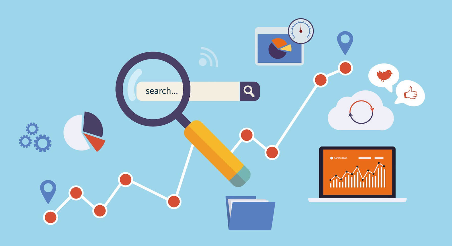
10 Things People Hate About Your Website
 So why is it that many websites are still full of the elements that so many visitors have moaned about over and over again? Perhaps with the sheer excitement that comes with designing your own website, all of the user experience quirks that have driven you crazy over the years escape your mind. But poor user experience can cause high page abandonment rates, low visitor-to-lead conversion rates, poor organic search listing positions, and a bad reputation. So here’s a list of the 10 most annoying things we’ve seen on websites to act as a sort of guide for what not to do when designing your website. Take a look at the worst offenders!
1) Pop-Up Ads – Let’s get the most obvious one out of the way. Pop-ups are seriously annoying. Yes, a pop-up could get you a few new email subscribers, but is that really worth all the traffic you lose when visitors abandon your site in annoyance? Convert site visitors into leads with well-written content and compelling CTAs/offers, not interruptive gimmicks.
2) Automatically Playing Multimedia Content When a Page Loads – Shhhh! I wasn’t supposed to be on this site at work! If someone’s enjoying what they thought was a silent browsing session and they’re bombarded with your theme song or a talking head on a video for which they didn’t press “play” and can’t find the button for “stop,” what do you think they’re going to do? Some might fumble for their mute button, but I can more easily locate the back button in my browser than my computer’s volume controls. Let visitors choose to play your multimedia content; don’t force it on them.
3) Disorienting Animations – You’re probably familiar with the blink test by now — the 3 seconds users have to orient themselves on any given web page before they click ‘back’ in their browser. Animations, auto-play videos, blinking and flashing paid advertisements, and other interactive entertainment may seem really cool (I’m sure it’s very well designed!) but it detracts from a visitor’s focus during those critical 3 seconds.
4) Generic Stock Photography – Show pictures of customers, real people that work at your company, your product, and your location. Or if you’re particularly design savvy, create visuals yourself that directly relate to what you do. Images are helpful if they clarify something for a visitor — generic stock photography doesn’t help visitors, so by extension, it doesn’t help you.
5) Unintelligible ‘About Us’ Page – Does your ‘About Us’ page explain what you do in business babble, or using the words and phrases common to the general population? Do a business babble check on your ‘About Us’ page to make sure you’re speaking in a language non-experts can understand. I recommend running it by a few friends and family members that don’t work in your industry for the best results.
6) SEO-Driven Copy – Remember back in the early 2000s when you went to a website and saw paragraphs and paragraphs of copy? Aside from being visually overwhelming, if you read that copy you’d find nothing more than a bunch of keyword-dense copy meant for crawlers, not humans. Unfortunately, some websites are still writing for bots, even though Google’s algorithm is far more sophisticated at determining a page’s relevancy than it was 10 years ago. In fact, now Google will ding you for these types of activities! There’s a difference between search engine optimized content and over-optimized content. Don’t write for crawlers; write for humans.
7) Not Including Social Sharing Buttons on Your Content – If you’re writing for humans, you probably have some really interesting content on your site. Content that people want to share on social media, perhaps. That’s why it’s a huge disappointment to scroll up and down looking for a “Tweet This!” button, only to realize there aren’t any social sharing buttons on your website! These buttons make social sharing easy for your readers – they don’t have to copy and paste your URL, shorten it, and compose a tweet. And easy social sharing options means your content gets more visibility, which means more site traffic, better search engine rankings, and more lead generation opportunities.
8) Your Call-to-Action Copy Doesn’t Align With the Offer – Your call to action should align with what visitors receive when they redeem your offer. There’s nothing more frustrating than being promised a 50% off coupon in the call-to-action copy, only to redeem it and find there’s a caveat that says you must first spend £100. On selected items. In-store purchases only. This is not only insulting to your visitors, but it will also kill your reputation and the conversion rates of your calls-to-action and landing pages.
9) Using Flash – Many designers use Flash on clients’ websites, and it’s enough to make a search marketer cringe along with the site visitors. The problem with Flash is not in its limitations; I’ve seen some stunning websites created with Flash! But search engines can’t read it, so your site won’t get indexed. And another problem? Visitors are often looking for a very specific piece of information when visiting your site — if they have to wait for a 10-second visual introduction to unfold on the screen before they can find your hours of operation, you’re going to have an angry customer (or would-be customer, depending on their level of patience).
10) The Worst Offender: I Don’t Know What to Do! – This is the worst offender in my opinion — when someone lands on your site, do they know what to do? Visitors need to be able to see immediately what your website does, what the value of that is, and what they should do next. Include clear headline copy, jargonless page copy that explains the value of what you do, and one clear primary call-to-action per page that shows visitors how to take the next steps — whether that’s subscribing to your blog, watching a video, or any other action you hope visitors will perform on your site.
More posts from our team
Five Star
Reviewed Marketing


 "Would definitely recommend to a friend"
"I cannot recommend Dental Design highly enough"
"Really great company to deal with"
"Very professional, efficient & adaptive to new situations"
"I cannot recommend them highly enough"
"Has been invaluable and gone out of her way to help us"
"We love the look of our practice website. Very professional!"
"Dental Design stood out both in their knowledge of the industry and their professionalism"
"The team and package offered at dental design was unrivalled"
"absolutely fantastic and are always on hand to help"
"Dental Design are fantastic to work with"
"always met with a swift and professional response"
"Would definitely recommend to a friend"
"I cannot recommend Dental Design highly enough"
"Really great company to deal with"
"Very professional, efficient & adaptive to new situations"
"I cannot recommend them highly enough"
"Has been invaluable and gone out of her way to help us"
"We love the look of our practice website. Very professional!"
"Dental Design stood out both in their knowledge of the industry and their professionalism"
"The team and package offered at dental design was unrivalled"
"absolutely fantastic and are always on hand to help"
"Dental Design are fantastic to work with"
"always met with a swift and professional response"
