What should be on my homepage?
 Your bounce rate is one of the various factors the seo team take note of when managing your website. For your bounce rate to remain low and to entice potential patients to look through your website, your homepage really does need to be top notch.
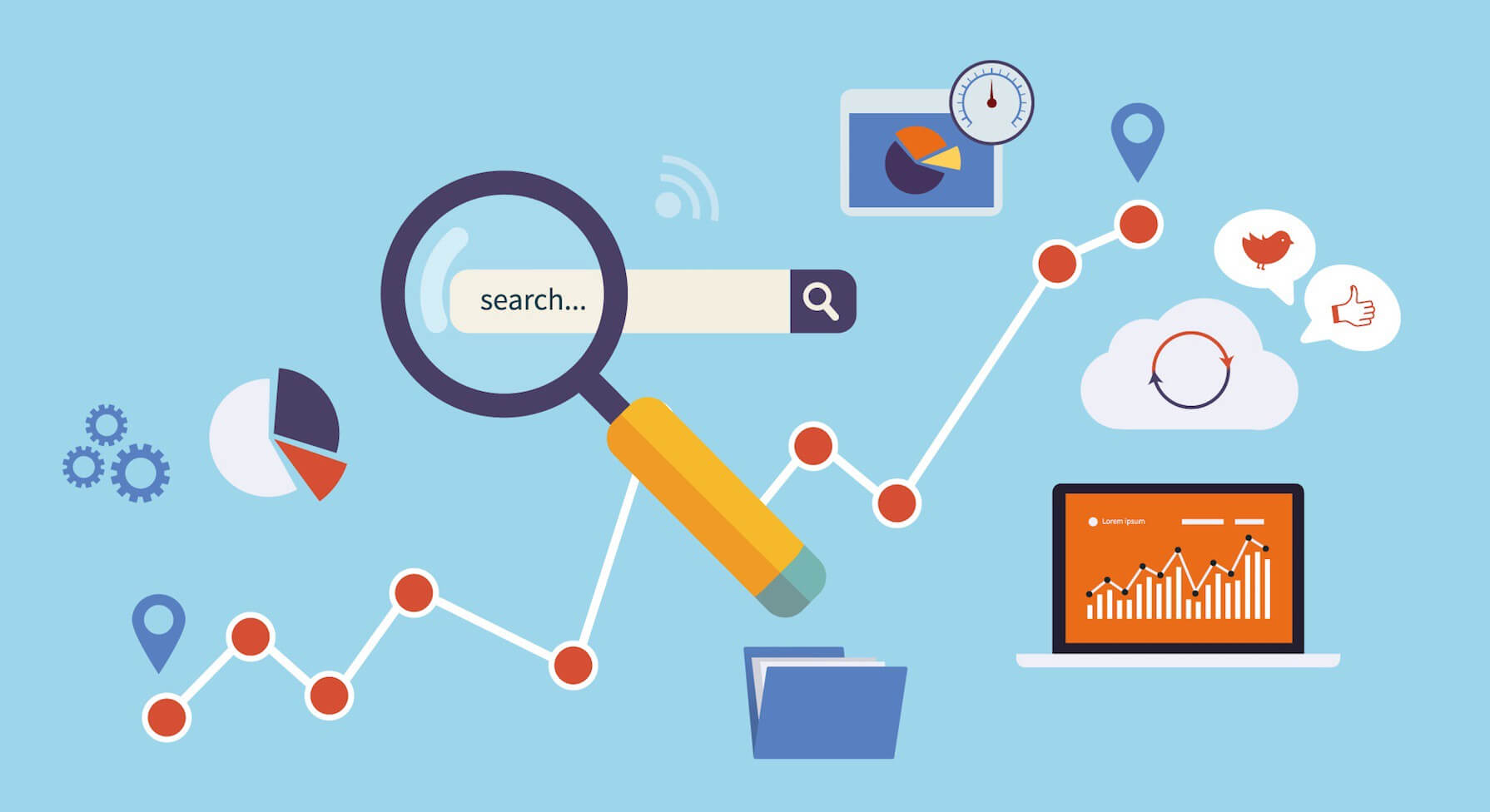
With so much time and effort devoted to interior pages like your treatment explanations, your case gallery and payment options, the average site homepage is either too cluttered to be effective or too barren for a patient to know what you actually do.
The result? A weakened conversion path and frustrated visitors.
Here are some best practices on what should be included on your site’s homepage and a few things to avoid.
Include: Who you are & why you’re trustworthy
Your homepage is your chance to quickly get across who you are and show that others like doing business with you. Your homepage lays the foundation for your site, conveying messaging, core values and shows people not only what you do, but how you do it.
The text and imagery you use should be carefully considered and deliberate, in order to paint a picture of who you are as a practice and practitioner. If your homepage is all a patient sees, would they know what you’re about? If not, your homepage isn’t working.
Another important way to use your homepage is to build trust. A person landing on your site for the first time is looking for cues that you’re reputable, trustworthy and will not cause harm to their appearance. Trust signals include sharing logos of brands you work with, patient testimonials, your social media profiles, etc. Let new visitors see that you’ve been around for a while.
Include: Your Benefits
The story is in the benefits, not in the features. Don’t go into depth with your clinical knowledge of a particular procedure, that’s for when the patient is in the chair. Instead, let them know how great they will look in their wedding pictures, or how a confident smile will help them land their next job.
Leave Off: Anything That Auto-Plays
Auto-play is intrusive and will bother your visitors which will therefore make them leave your homepage quickly, resulting in an increased bounce rate and the loss of potential patients.
Include: Clear Navigation and CTA’s
Having a clear navigation structure will help your patients complete their task; ensure that you know what you want your visitors to do when they land on your site, be clear and show them how to do it directly from your homepage.
Leave Off: The Kitchen Sink
The purpose of your homepage is to get people into the rest of your site doing the things you want them to do. You may want them to read your blog, to download a resource, or to watch the videos on your treatment pages- these should be the primary calls to action on your homepage.
Your homepage should give visitors what they need and nothing else. Presenting too many options may confuse patients and put them off your practice. Put your most popular treatments on your homepage, not every treatment; if patients like what they see initially, they will look around. By limiting the calls to action and information, you make it easier for customers to understand what comes next.
Include: An Immediate Offer
Whether it’s a download, a newsletter to subscribe to, or a social media site to join, your homepage should provide an immediate way to begin a relationship with your practice.
Is your homepage doing what it’s supposed to do? Is it answering the necessary questions and putting customers on the path to a new smile? If you haven’t taken a look at it recently, now is the time. Give the team at Dental Design a call on 01202 677 277 who will be happy to help you.
More posts from our team
Five Star
Reviewed Marketing


 "Would definitely recommend to a friend"
"I cannot recommend Dental Design highly enough"
"Really great company to deal with"
"Very professional, efficient & adaptive to new situations"
"I cannot recommend them highly enough"
"Has been invaluable and gone out of her way to help us"
"We love the look of our practice website. Very professional!"
"Dental Design stood out both in their knowledge of the industry and their professionalism"
"The team and package offered at dental design was unrivalled"
"absolutely fantastic and are always on hand to help"
"Dental Design are fantastic to work with"
"always met with a swift and professional response"
"Would definitely recommend to a friend"
"I cannot recommend Dental Design highly enough"
"Really great company to deal with"
"Very professional, efficient & adaptive to new situations"
"I cannot recommend them highly enough"
"Has been invaluable and gone out of her way to help us"
"We love the look of our practice website. Very professional!"
"Dental Design stood out both in their knowledge of the industry and their professionalism"
"The team and package offered at dental design was unrivalled"
"absolutely fantastic and are always on hand to help"
"Dental Design are fantastic to work with"
"always met with a swift and professional response"
