Google Revamps Homepage
Google has launched an update to their homepage, which  is slowly being rolled out to all users, and it is one of the biggest changes to their homepage to date. The Google homepage will no longer have the black toolbar running across the top of the page which promotes the company’s other products. Instead, the bar is replaced by a grey logo which is clickable, revealing seven services with the option to reveal a further eight.
The idea behind the revamp is to promote Google’s business without cluttering up the homepage and to improve the user’s experience. A spokesman for Google said:
“Constant revision and improvement is part of our overarching philosophy,”
“If you compare the original Google home page to today’s version, you will see that a makeover every so often can certainly be refreshing.”
Consequently, it now takes two clicks to enter services such as images and news, which Google hope users will just be lazy and search using the usual search bar, allowing them to show more pay per click advertising to users as the news section, for example, does not show sponsored ads.
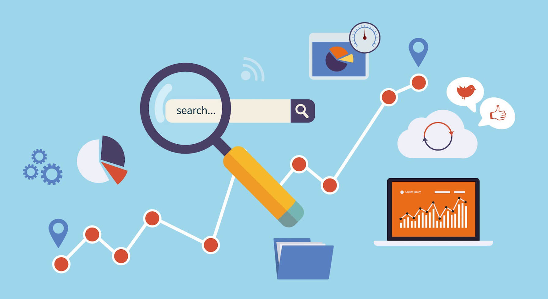
Google is a prime example that those with websites in all industries shouldn’t be complacent with their websites and sit on their laurels. For that reason it’s of extreme importance to regularly update your website with fresh content however big or small and if you feel your website is looking tired don’t be afraid to redesign and start from scratch. At dental design were more than happy to discuss the different options available to you to make sure that you and your patients get the most out of your website.
More posts from our team
Five Star
Reviewed Marketing


 "Would definitely recommend to a friend"
"I cannot recommend Dental Design highly enough"
"Really great company to deal with"
"Very professional, efficient & adaptive to new situations"
"I cannot recommend them highly enough"
"Has been invaluable and gone out of her way to help us"
"We love the look of our practice website. Very professional!"
"Dental Design stood out both in their knowledge of the industry and their professionalism"
"The team and package offered at dental design was unrivalled"
"absolutely fantastic and are always on hand to help"
"Dental Design are fantastic to work with"
"always met with a swift and professional response"
"Would definitely recommend to a friend"
"I cannot recommend Dental Design highly enough"
"Really great company to deal with"
"Very professional, efficient & adaptive to new situations"
"I cannot recommend them highly enough"
"Has been invaluable and gone out of her way to help us"
"We love the look of our practice website. Very professional!"
"Dental Design stood out both in their knowledge of the industry and their professionalism"
"The team and package offered at dental design was unrivalled"
"absolutely fantastic and are always on hand to help"
"Dental Design are fantastic to work with"
"always met with a swift and professional response"
