The ‘About us’ page…
 It is very important to design and implement your ‘about us’ page for your dental practice. This page after all is one of the main features of your dental website where customers and potential customers will for the first time view you. Therefore it makes sense to make this page visually stunning and as attractive as possible to ensure that a good image is portrayed to the observer. Think about it, if you were interested in using a particular business and the ‘about us’ page was very boring and bland, would there be anything shouting out to you to use this business? If the ‘about us’ page was visually strong, interesting and creative, would you not be more inclined to check out this business!?
The following article features some amazing creations for ‘about us’ pages that you too could use on your dental websites!
About pages are important because they are the place where the user goes to discover more about who/what is behind the site they are visiting. From design studios to apps and online shops, users like to browse a page to find the good old who, where, what, how information about you. And of course there’s many different approaches that can be taken when designing an about page. From the very formal to the fun and creative, it’s important to go the direction that’s fits the personality of you or your company. Today we gathered a some inspiring examples of about pages to show you how different websites are allowing visitor to learn more about them.
FancyRhino
I always like the creative-humorous approach using pictures. It’s nice to see faces behind ideas.
12th of Never
A nice and minimal approach in a landing page with a “more coming soon” note.
H-Art
A nice combo of beautiful images and well designed info-graphics to give us more details about their work.
Oliver Russell
Nice and elegant approach to the “what we do” page. Beautiful typography and colors.
Doberman
A cool mix of illustrated elements, typography and images to present their work, values and team.
And of course a creative studio focused on encouraging imagination would go for an imaginative about page, well done.
Pulp Fingers
Another colorful creative approach to present who is behind work.
Pursuit
For a stylish suit shop nothing better then a well suited team page.
Ghosthorses
Ghosthorses decided to use a nice typography combo to tell us more about their work and the outcome is really nice.
FO
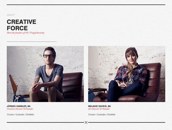
FO divided their about in two beautifully done parts: who we are – explaining their values, creative force – showing their founders.
Fear the Grizzly
Clean and minimalist layout with a few images and texts explaining their work.
WeMake
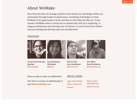
A beautiful single page design with a nice about section with text and faces. ![]()
shoplocket
Great colors, textures, typography and icons to explain their work and ideas.
FiftyThree
Beautiful typography based about page.
COOP
For a coworking space, nothing better than using a beautiful background image showing the space. They are also using nice colors and transparency to tell more about their story.
Trailer Park Truck
A creative and less formal approach to the old and good who we are page.
Haus
Haus is using a delicate palette with nice images and text in a timeline to present their team and milestones along the way.
Blind Pig Design
Blind Pig Design counts with a photo of Aaron Awad (the founder) in action and a nice text to tell us more about the studio. They also count with a beautiful textured side bar menu. ![]()
More posts from our team


