The Case for a clear call to Action on your homepage

Fact 1 #Dental practices need patients.
Fact 2 #Dental practice websites need users.
Fact 3 #Your home page needs one clear Call to Action.
It’s a vastly overrated notion that a homepage should include all sections of your website and serve all kind of visitors. We often talk to our clients about keywords and using the home page as a tool to optimise for these. However, there is a fine balance between optimising a home page with multiple big ticket treatments that appeal to a variety of patients, and focusing your call to action to one standout message.The following post, extracted from a post written by Yoast's Michiel Heijman, argues the case for a clear and easy user path, starting with a strong call to action on the best page you’ll ever have.
Clut-ter
Noun – A collection of things lying about in an untidy mass
Verb – Crowd (something) untidily; fill with clutter
Synonyms – confusion – muddle – mess – disorder – muss – jumble
The need to put everything on one homepage
Employment websites do it. “Employers subscribe here”, “Companies list here”, “Latest jobs”, “Build your resume”. Real estate agents do it. “Buy these new homes”, “Sell your home with us”, “Latest sales”, “Upcoming events”. That’s really just the tip of the iceberg.
It seems that most homepages are designed with one thing in mind: “How do I make everything on my website accessible from this one single page.” Well, you can’t. Not in a way that your visitor will understand your company, product or really anything at all.
One clear Call to Action
To guide your visitor into or through your website, you should give him directions. Pretty similar to how a road needs road signs actually. Yes, you can put up multiple signs, but you should make the most important ones the biggest. Make it as big as possible. Make it stand out.
Everybody has visited that one great looking website in all shades of grey that had an orange RSS button that drew all attention. That’s really bad design in my opinion. The thing that stands out is your call to action: that’s what you want visitors to click on.
A different approach to a Call to Action
There are many ways to use and implement this call to action. One is using the big bold button, preferably in a colour that is not used in the design of the website (the orange RSS button mentioned above). You might also use whitespace to emphasize a specific part of the homepage, making it stand out that way.
We recently had a client for a website review who has this (quite common) idea of starting his website with a choice: three options for three variations of a product. That would imply three call to actions…
No problem, if you combine the two ways mentioned above. So make a block that really stands out (use sufficient whitespace around it) and add three similar call to actions, with (very important) a descriptive title for that block, like “Make your choice”. That way, the entire block becomes your call to action.
Now let’s illustrate the simplicity of call to actions by looking at some example websites.
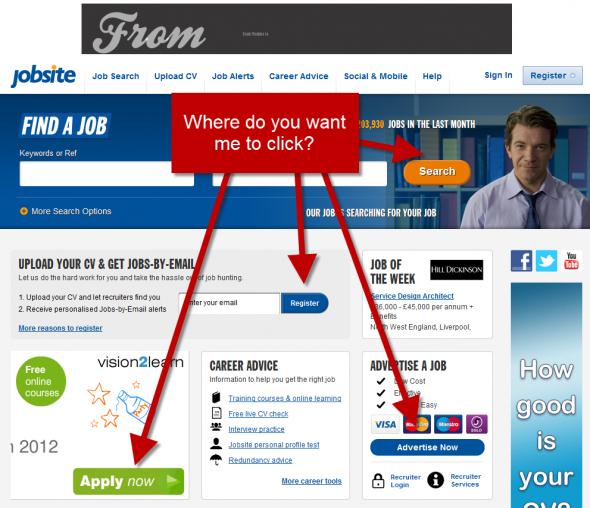
Jobsite.co.uk
“Jobsite is a leading UK online recruitment site, dedicated to helping you find your next job.”
I actually got lost on your homepage already. Yes, I understand you want me to search for my next job on your page, or do you really want me to register first? One very distracting issue this homepage has is that the Vision2learn banner has the largest call to action of the page…
Scuolaleonardo.com
Since we do website reviews for websites from all over the world, I decided to look up an Italian School in Italy and found Scuola Leonardo da Vinci. After looking at their website, I decided to stick to Google Translate… as I couldn't find where to apply for a course.. The question “Where do you want me to click???” is impossible to answer for this website. The total lack of a call to action, combined with the overall clutter, makes a visitor head back to Google in the blink of an eye.

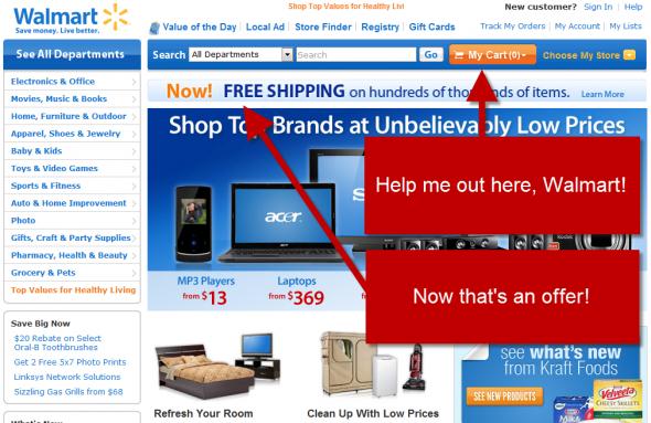
Walmart.com
Help me out here, Walmart. Why do you want me to click my empty cart? Don’t get me wrong, for shopping sites, emphasizing the cart is always a good thing. But I think what Walmart wants me to click is something else, like the free shipping offer or perhaps a product I could buy. Now that should be the orange button on that homepage! Also, the banner “Shop Top Brands” is just a list of products and prices. The call to action on that banner should also be clear (“Shop NOW” or something like that).
If your home page is confusing– muddled – messy – disordered – mussy – jumbled, then get in touch with Dental Design on 01202 677 277 for a review and solutions to improving your best online asset.
More posts from our team
Five Star
Reviewed Marketing


 "Would definitely recommend to a friend"
"I cannot recommend Dental Design highly enough"
"Really great company to deal with"
"Very professional, efficient & adaptive to new situations"
"I cannot recommend them highly enough"
"Has been invaluable and gone out of her way to help us"
"We love the look of our practice website. Very professional!"
"Dental Design stood out both in their knowledge of the industry and their professionalism"
"The team and package offered at dental design was unrivalled"
"absolutely fantastic and are always on hand to help"
"Dental Design are fantastic to work with"
"always met with a swift and professional response"
"Would definitely recommend to a friend"
"I cannot recommend Dental Design highly enough"
"Really great company to deal with"
"Very professional, efficient & adaptive to new situations"
"I cannot recommend them highly enough"
"Has been invaluable and gone out of her way to help us"
"We love the look of our practice website. Very professional!"
"Dental Design stood out both in their knowledge of the industry and their professionalism"
"The team and package offered at dental design was unrivalled"
"absolutely fantastic and are always on hand to help"
"Dental Design are fantastic to work with"
"always met with a swift and professional response"
